Cube Studies: Point, Line, Texture, Continuity

This was a project I developed for my 2D Foundations class. Students were provided a flat box to explore line, pattern and contour drawings. One of the goals was to provide some continuity from panel to panel. Student could use color or could use monochromatic ink. Students then had to cut out the box template, score the edges and assemble them. They were evaluated on craftsmanship as well as originality of design and innovation.

Student Work 2021 Spring
Benedictine College


Student Work 2020 Fall
Benedictine College


Student Work 2017
Roberts Wesleyan College

e


Perpetual Calendar: Collaborative 2D Project

I was inspired to change up the final project for my 2D Foundations Class this year which was to be centered around color, color mixing and utilizing primary, secondary and tertiary colors derived solely by mixing primary colors. In the past I had student develop patterns on a square canvas with specific areas that were designated as primary, secondary and tertiary — but this particular class was highly motivated and exceptionally creative, so I knew that they would be up to the challenge of doing something collaborative and also more intense. So, I engineered a perpetual calendar that would be installed in the department administrator’s office. I worked out how many rows we would need, how many blanks we would need for the year and also how many letters we would need to create the months.

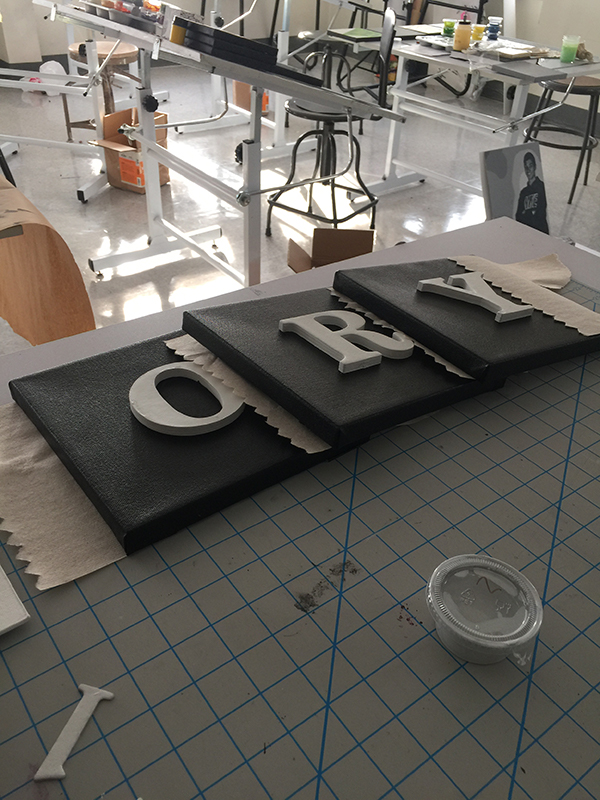
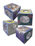
We used chipboard letters and numbers. Students could position the numbers where they wanted to into their designs. The letters for the months and days of the week were positioned in the center of each canvas. I made a template to help student to position the letters in the proper position. The letters were attached with liquid nails.

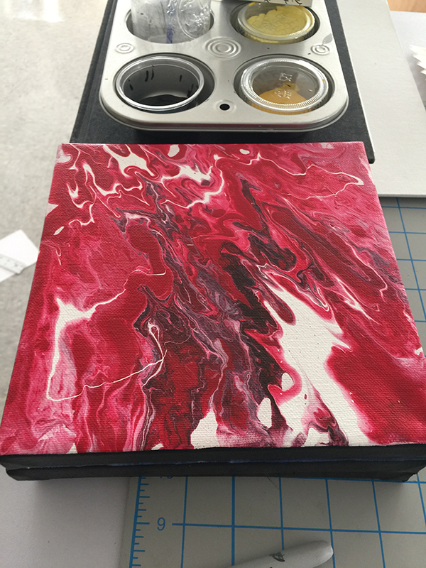
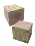
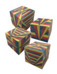
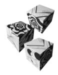
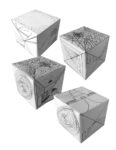
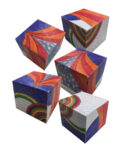
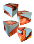
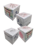
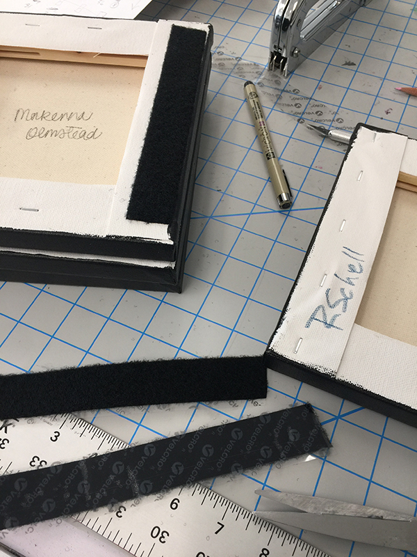
Additionally, I worked out how we would install the art after all the components were painted. The students picked numbers out of a box to split up the tasks. We used 8×8 canvases. The edges were painted black and we used 1″ female velcro on the back vertical edges to mount on a grid made from 2″ male velcro. Each number in a month was pre-designated as a particular color scheme, but students could decide the design of their square.

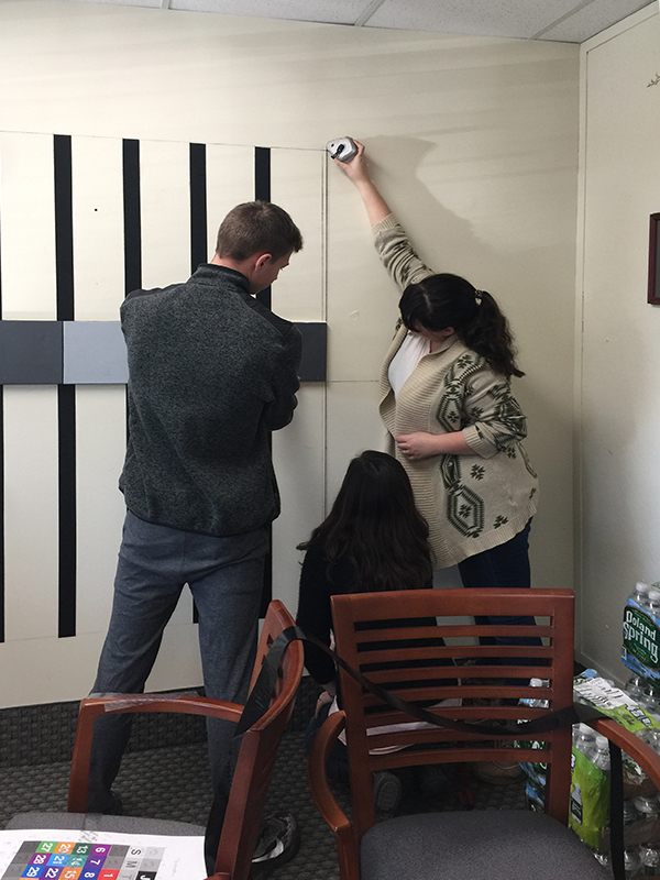
Students installing the calendar in the Administrator’s office.
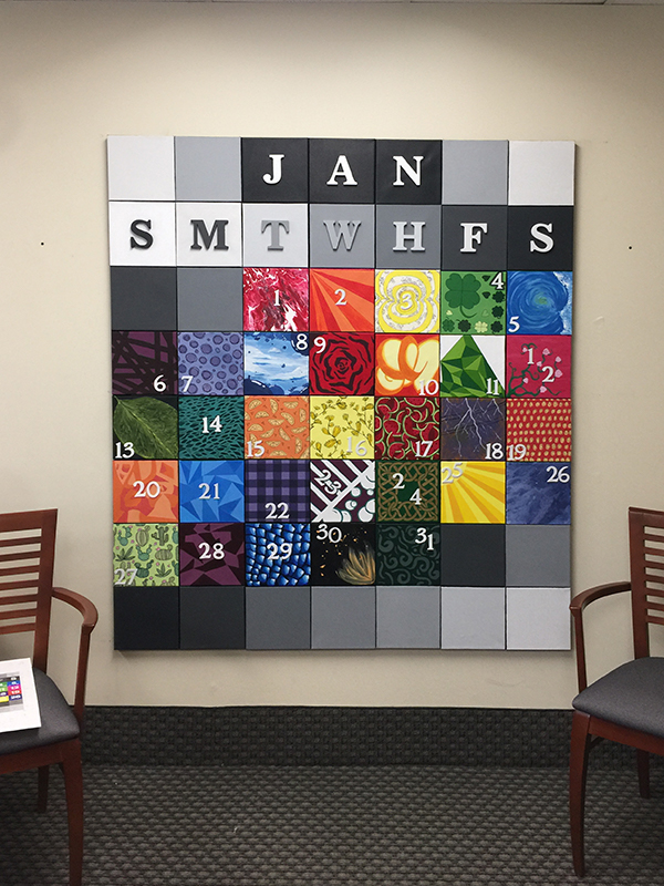
The final calendar.

Design Foundations: Little in the Landscape

Intro to Digital Media Art
Little in the Landscape

Students develop landscapes where they are the little subjects in a large environment. Student work in the photo studio to take pictures in poses for their landscape and learn to create crisp silhouettes and shadow effects within a photographed environment. 

Student Work: 2018 Roberts Wesleyan College


Book Jacket Designs

This was a new project that I created for students to think about graphic as applied to book design. Students were to create hand cut mockups and also a photo-rendered mock up. 


Virtue Poster Series

A challenging project for students in Graphic Design 2 is to create a poster series about Virtue. Students can choose virtue, vice or contrast them in the series. They can choose the style, fonts, and messages. These are printed professionally.

Click on the individual images to enlarge them.


by Alyssa Bleiler


by Ella Zehr


by Emily Oud


by Jameson Hoffman


by Moriah Wolfe


by Rebekah Sanchez


by Rachel Lindke


by Emma Rowlands


by Stephanie Piper


by Dana Miller

Type Anatomy Posters

One of the first projects I have my typography students create is a poster series to creatively explore the anatomy of typography and to develop a cohesive design set. These posters are printed professionally so students begin to learn how to prep files for commercial printing. 

Click on the images to view larger.


by Ella Zehr


by Stephanie Terwilliger


by Rachel Lindke


by Alicia Salerno

Independent Study

This is a collection of work by students who have explored graphic design in more depth based upon their particular interests in various topics.


Shannon wanted to create a typeface that would be helpful for people with dyslexia. The result of her work was put into this booklet to document the font she designed.

by Shannon Sweeney


Packaging Design by Jamison Hoffman


Mograph: Moving Words – Student Projects

Students were challenged to use dialog, a poem, or writing and utilize typography and graphics that reflected the style of the text along with adding the spoken word into the final projects. This was an early on project where students are first exploring moving text and synchronizing the voice over to the graphics on the screen.


by Liz Skowron


by Stephanie Piper


by Shannon Sweeney