Author: sueleo
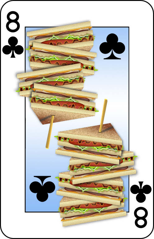
Ate of Clubs
Illustration done in Adobe Photoshop and Illustrator.
This design was selected to be printed in a playing card series that was printed in Canada.
Schoenhals Symposium Promotional Poster
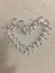
Devotional

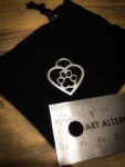
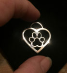
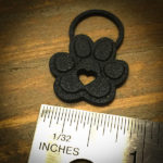
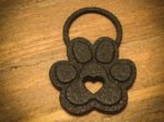
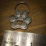
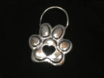
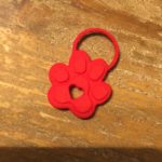
Paws
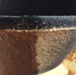
Photography – Details + Textures

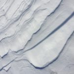


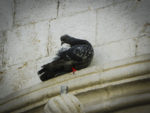


Photography – Landscapes + Wildlife


Ceiling Danglers: Pittsford Federal Credit Union
Point of Purchase Displays designed to hang above the teller stations
from drop ceilings to promote their “Did You Know?” customer education initiative.


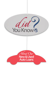
The bottom danglers are interchangeable
so that they can be swapped out to keep the message fresh
depending upon what the bank wanted to promote.
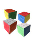
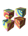
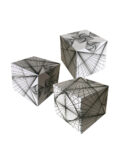
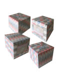
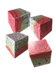
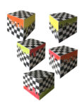
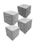
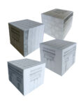
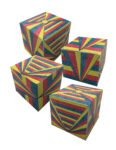
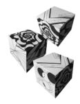
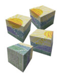
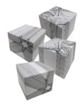
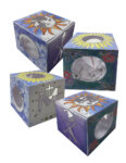
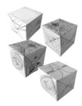
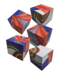
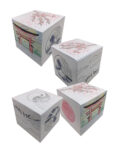
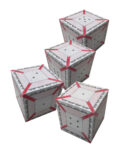
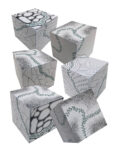
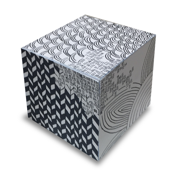
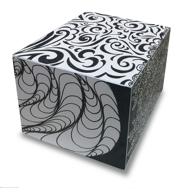
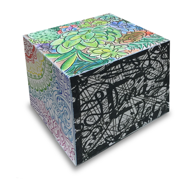
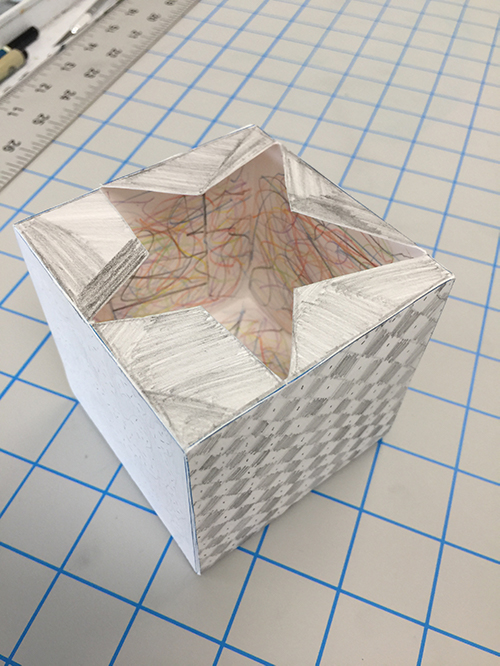
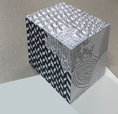
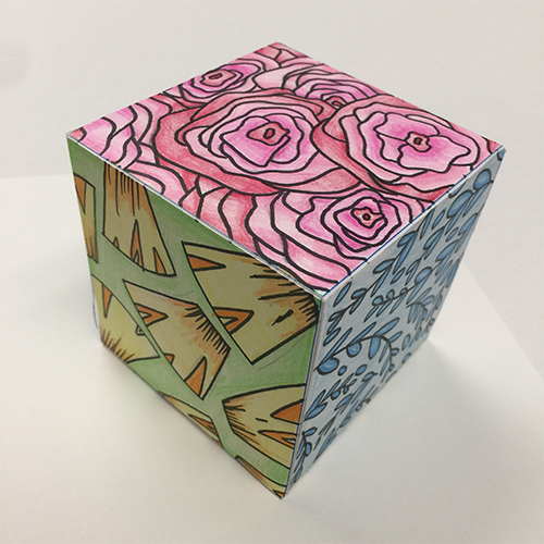
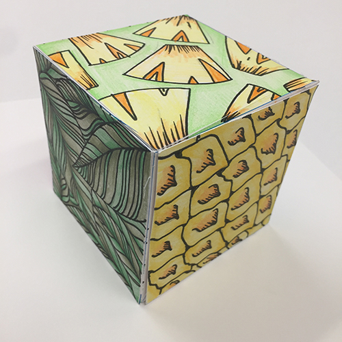
Cube Studies: Point, Line, Texture, Continuity
This was a project I developed for my 2D Foundations class. Students were provided a flat box to explore line, pattern and contour drawings. One of the goals was to provide some continuity from panel to panel. Student could use color or could use monochromatic ink. Students then had to cut out the box template, score the edges and assemble them. They were evaluated on craftsmanship as well as originality of design and innovation.
Student Work 2021 Spring
Benedictine College
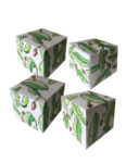
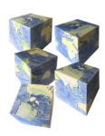
Student Work 2020 Fall
Benedictine College

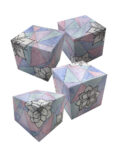

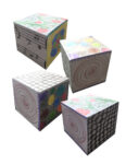

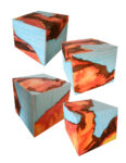
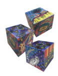
Student Work 2017
Roberts Wesleyan College
e
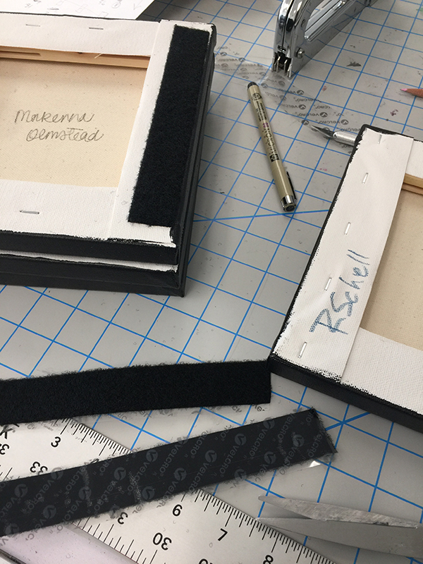
Perpetual Calendar: Collaborative 2D Project
I was inspired to change up the final project for my 2D Foundations Class this year which was to be centered around color, color mixing and utilizing primary, secondary and tertiary colors derived solely by mixing primary colors. In the past I had student develop patterns on a square canvas with specific areas that were designated as primary, secondary and tertiary — but this particular class was highly motivated and exceptionally creative, so I knew that they would be up to the challenge of doing something collaborative and also more intense. So, I engineered a perpetual calendar that would be installed in the department administrator’s office. I worked out how many rows we would need, how many blanks we would need for the year and also how many letters we would need to create the months.
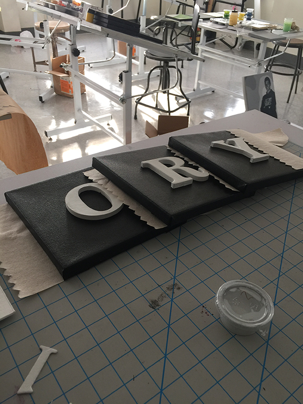

We used chipboard letters and numbers. Students could position the numbers where they wanted to into their designs. The letters for the months and days of the week were positioned in the center of each canvas. I made a template to help student to position the letters in the proper position. The letters were attached with liquid nails.


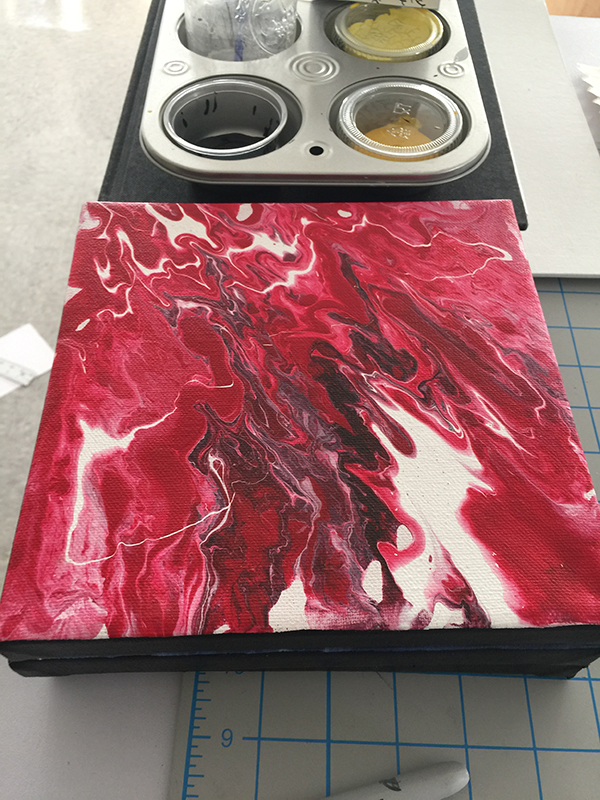
Additionally, I worked out how we would install the art after all the components were painted. The students picked numbers out of a box to split up the tasks. We used 8×8 canvases. The edges were painted black and we used 1″ female velcro on the back vertical edges to mount on a grid made from 2″ male velcro. Each number in a month was pre-designated as a particular color scheme, but students could decide the design of their square.

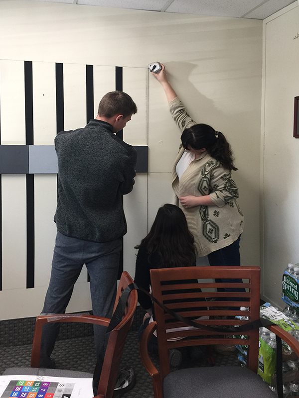
Students installing the calendar in the Administrator’s office.

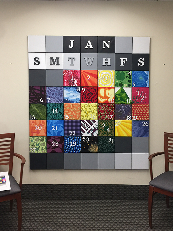
The final calendar.